Felipe Espinoza

Senior Data Analyst
Portfolio
Press the title of each project and you will be redirected to the project’s page.
If you want, you can find me in my other pages:
Project 1: Death in Chile 1990 - 2024. Power BI Report
Power BI Report of related to the Python’s data analysis but with a bigger dataset. This is a Power BI Report, so it’s fully interactive.
The report compiles data published by the Department of Health Statistics and Information (DEIS), part of the Chilean Ministry of Health. This report focuses on providing general information on deaths that occurred in the Republic between 1990 and 2024, with data for the years 2022 to 2024 still being preliminary. For a better understanding, the report is divided into five detailed pages:
- General information page.
- Biological Sex
- Age
- Cause of Death
- Accidental/Voluntary Death
- Region
This report is not intended to be used by health authorities, but to provide general information to citizens, closely following the concept of ‘Citizen Analyst’. The data on the Human Development Index has been compiled from the publication ‘El desarrollo humano de las comunas de Chile’, published by the United Nations Development Programme (UNDP) in June 2024. Within the report you can usually select any element in a table or visualization to filter the rest of the page. I encourage you to play with the elements within the pages to discover new information.

Project 2: Death in Chile 2016 - 2021(I)
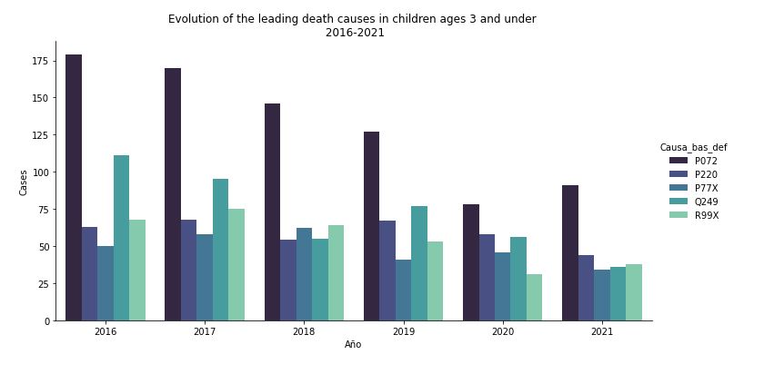
Data exploration within Kaggle Notebook using Python on a dataset containing information about the date, primary cause of death and other information concerning deaths in Chile from 2016 to 2021.
With this data I was able to answer various questions:
- What was the primary cause of death in 2021 in Chile?
- What were the top five causes of deaths in Chile in 2021, each year since 2016, and accumulated?
- What is the most common cause of death by region?
- Is there any difference between the causes of death for men and women?
- What is the main cause of death among children of 3 and under?
- Evolution of deaths caused by COVID disease (2020-2021)
There is also a second part of this analysis that you can find here.
The data source was the chilean Department of Statistics and Health Information. The dataset can be found here
Project 2: Energy production, trade and consumption
SQL data exploration of an Energy, production, trade and consumption database. With this exploration I was able understand this dataset with insights like:
- Compare the Energy supply per capita in gigajoules between South America, North America and Europe.
- The average primary energy production in the world.
- Percentage difference between the country with the lowest energy suppply per capita and the rest in a list containing: Brazil, Chile, Argentina, Peru, Uruguay, Bolivia, Colombia and Ecuador.
- Seeing the evoution of energy production in Germany and comparing it with the Russian Federation.
You can also visit the Tableau visualization for this dataset here
The dataset can be found here
Project 4: Data visualization with Python: Github Public Repositories visualization
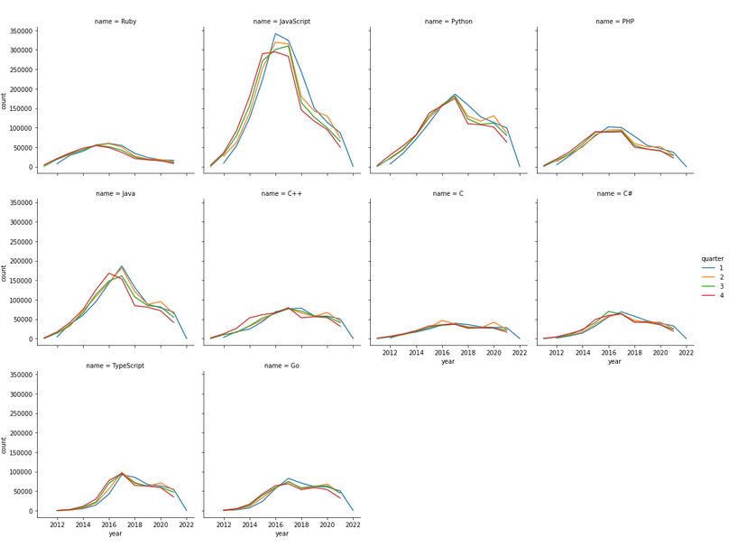
Data visualization only with Python’s library Seaborn. With this visualization I was able to show the evolution of the top 10 programming languages in the GitHub Repositories from 2011 to 2022. With this kind of visualizations you could compare and analyse any programming language present in the database with a hight level of control. Some of the insights you can get from this visualizations are:
- Top 10 by number of (public) repositories
- Programming language with the maximum amount of issues in a quarter from 2011 to 2022.
- Visualization for each of the top 10 programming languages by number of issues.
- Maximum number of pulling requests (2011-2022) in a quarter.
Project 5: Historical IDA statement of Credits and Grants in R
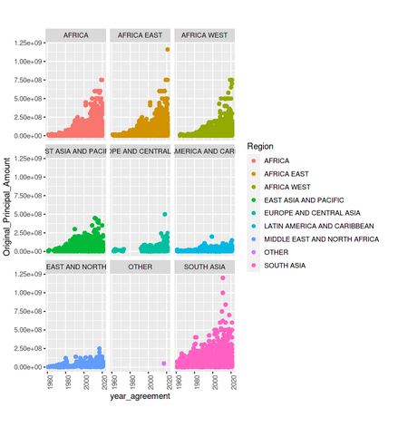
Data exploration of the historical International Development Association statement of Credits and Grants made in R. Examples of information we obtained thought this analysis were:
- Regions which were receiving credis.
- The median and the maximum of the Original Principal Amount by country
- The number of credits and grants that were for China, and what are their status
- The number of transactions and projects between IDA and China and India.
The dataset can be found here.
Project 6: Hate crimes in Catalunya
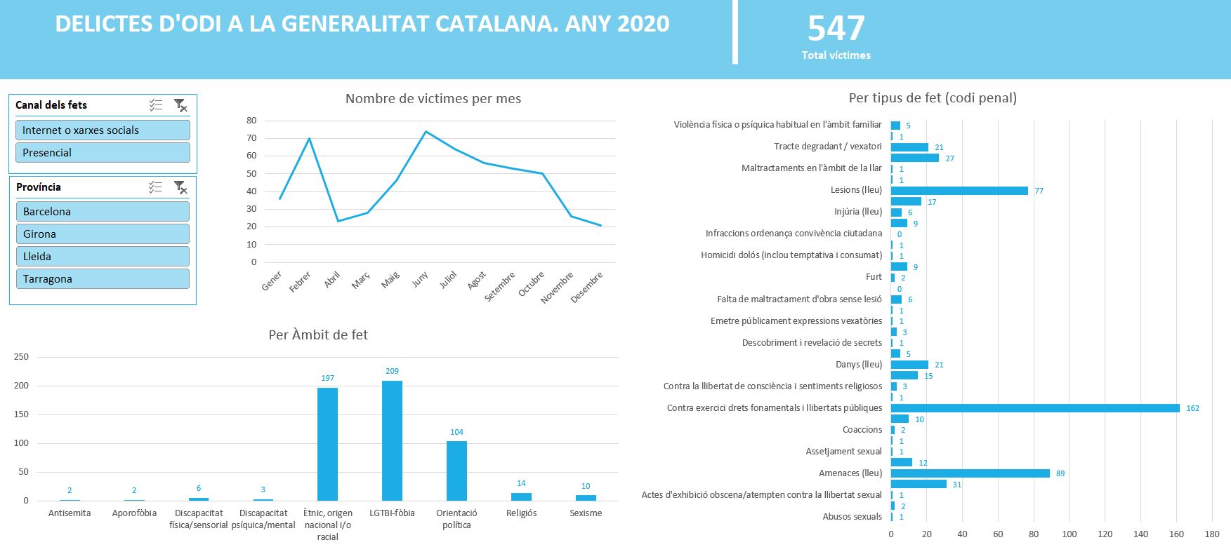
Simple Excel Dashboard showing hate crimes comitted in Catalunya during 2020. Also contains a pivot table for more information. With this dashboard you can filter the data by:
- Way in which the crime took place.
- Province.
- Total number of victims.
This dataset was cleaned with Python before using it in Excel. The dataset can be found here
You can download the Excel file here. This file is in catalan.
